Keazy is a modern construction management platform designed to simplify the home-building journey. The interface focuses on clarity, trust, and ease of use, empowering users to manage projects confidently—from planning to completion—without jargon, stress, or unnecessary complexity.
UX/UI Design
Market Research
Website Design

Industry
Real Estate
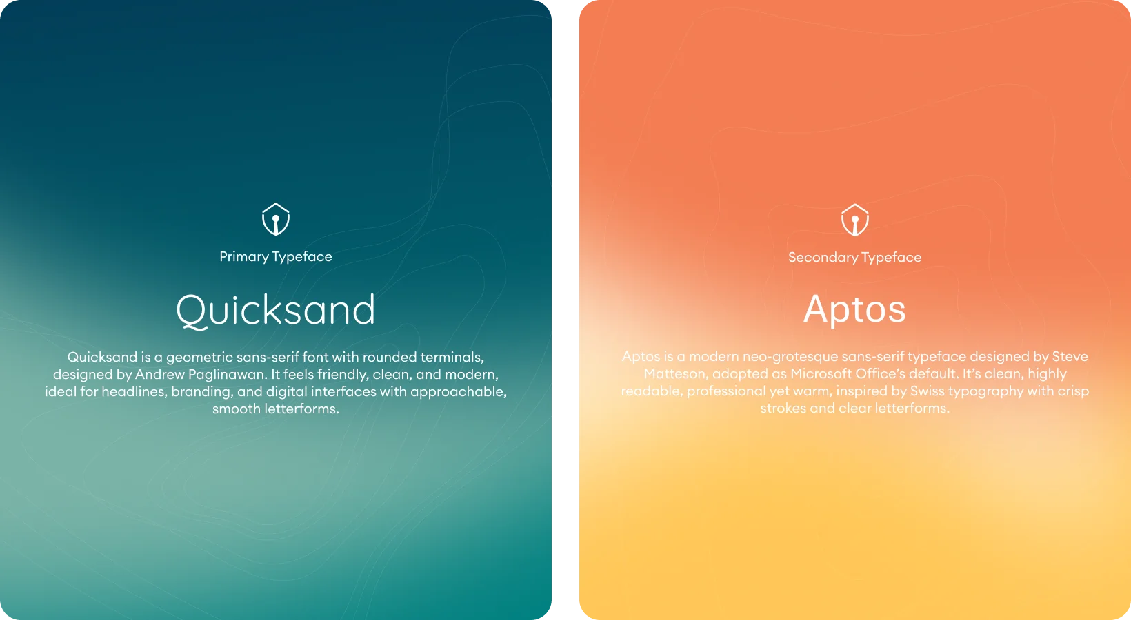
Tools we used


Project Completion
2025
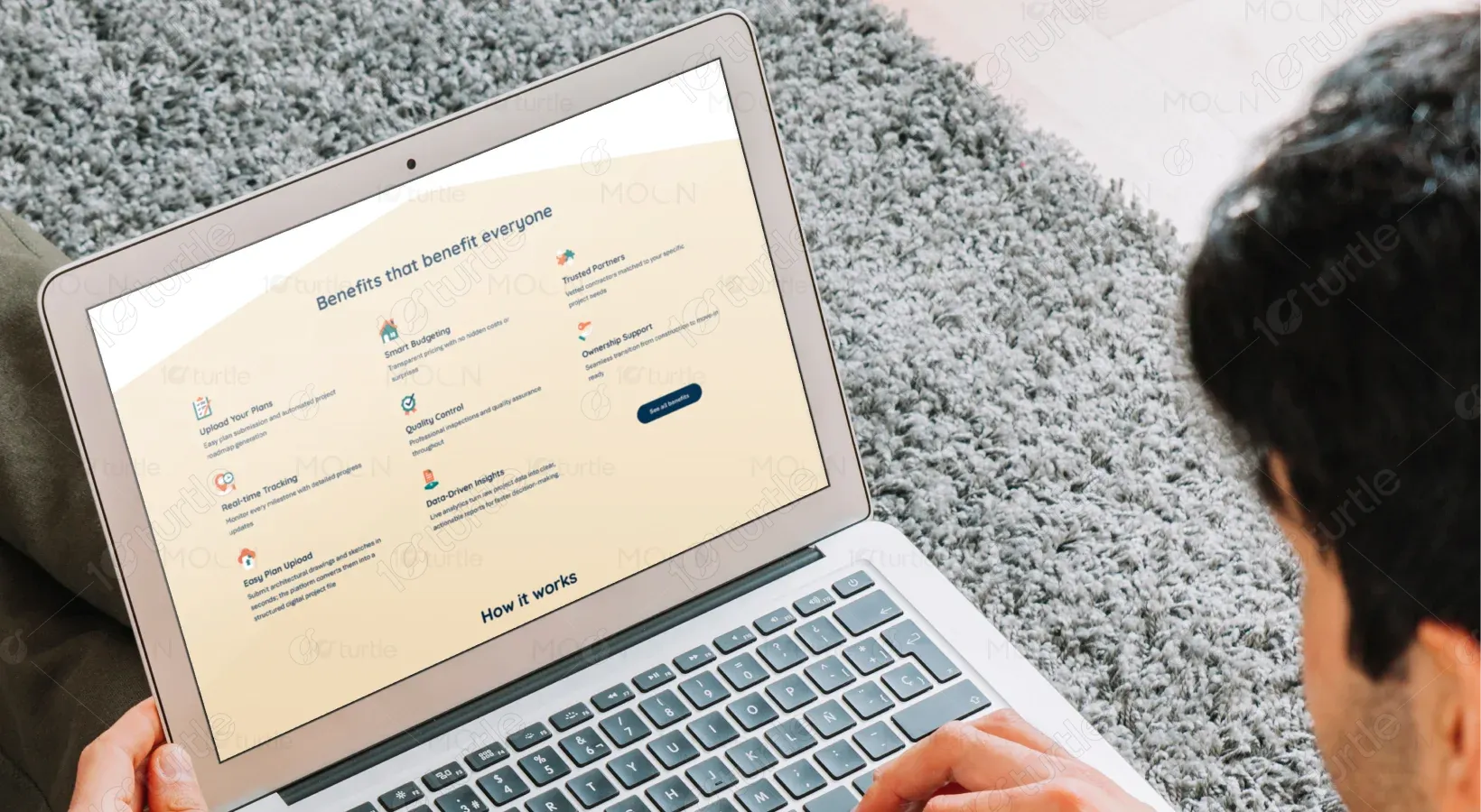
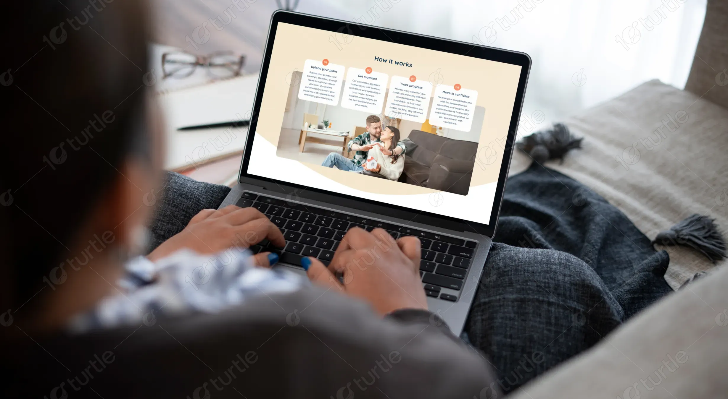
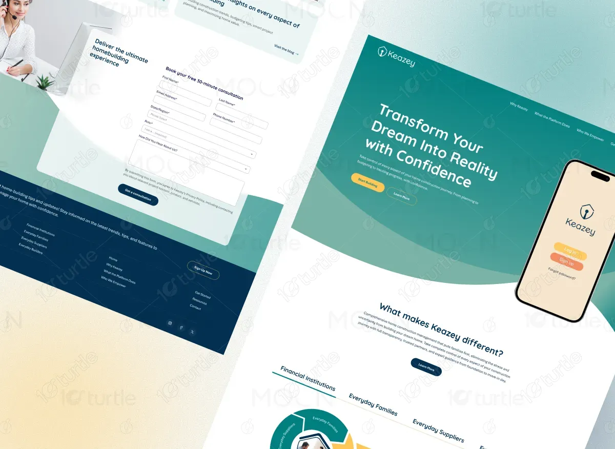
The overall design emphasizes a clean, approachable, and professional aesthetic. Soft curves, balanced spacing, and friendly imagery create a sense of trust and comfort. The layout guides users smoothly through features, benefits, plans, and testimonials, ensuring a seamless and intuitive browsing experience.

Industry
Real EstateWhat we did
User ResearchUI UX DesigningPlatform
WebsiteManaging construction projects is often overwhelming due to scattered communication, unclear timelines, budget overruns, and lack of transparency. Users struggle with complex tools, technical jargon, and poor visibility into progress, leading to stress, confusion, and loss of confidence throughout the building process.
Keazy solves these challenges by offering a centralized, easy-to-understand platform that simplifies construction management. Clear workflows, real-time tracking, smart budgeting, and transparent communication empower users to stay informed and in control, transforming a stressful process into a confident, guided experience.
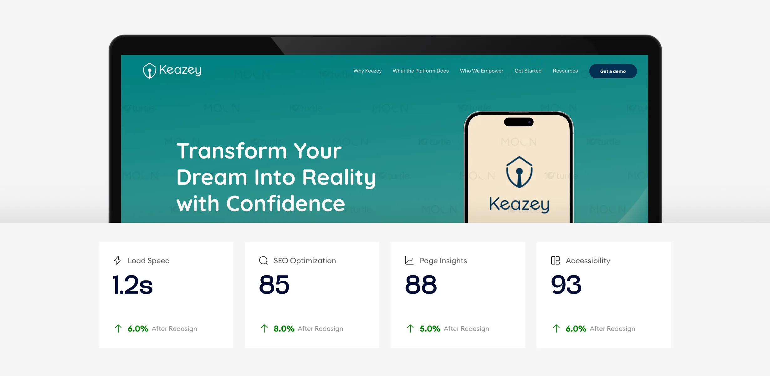
The design showcases luxury and refined aesthetics with enhanced performance across key metrics. With a load speed of 1.3 seconds, the site ensures quick access, while the SEO score of 91 boosts visibility. Improved accessibility and page insights contribute to a more engaging, smoother user experience, enhancing overall performance.
By designing a user-friendly interface with clear messaging, visual progress tracking, relatable imagery, and straightforward plans, Keazy builds confidence and trust while eliminating complexity and confusion.

The Keazy logo reflects simplicity, reliability, and modern construction values. Its clean typography and minimal iconography communicate professionalism and trust. The logo seamlessly integrates with the interface, reinforcing brand recognition while maintaining a friendly and approachable identity across the platform.
The color palette combines calming teal tones with warm neutrals and soft accents. Teal represents trust, stability, and growth, while beige and white backgrounds add warmth and balance. Accent colors highlight key actions, creating visual interest without overwhelming the user.

The wireframe prioritizes clarity and user flow, mapping content in a logical, step-by-step structure. Key sections such as benefits, how it works, pricing, and testimonials are strategically placed to guide users naturally, ensuring intuitive navigation and a frictionless user journey.